Blissful Bee Organic Honey Packaging
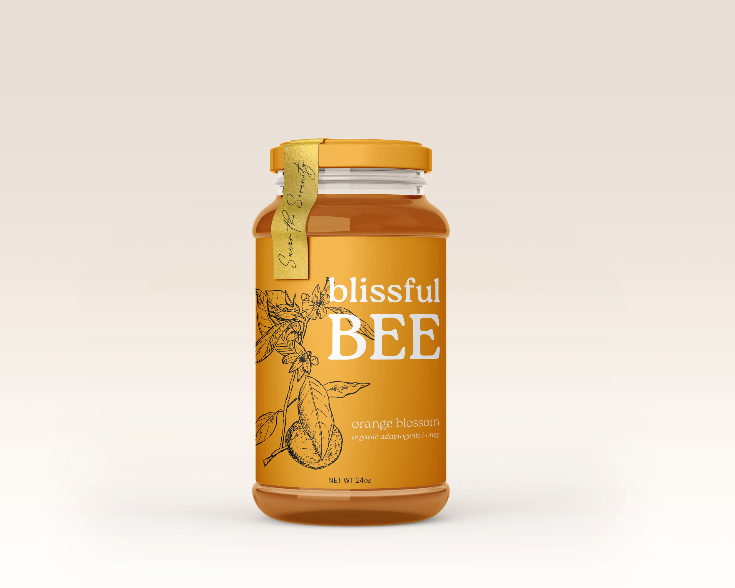
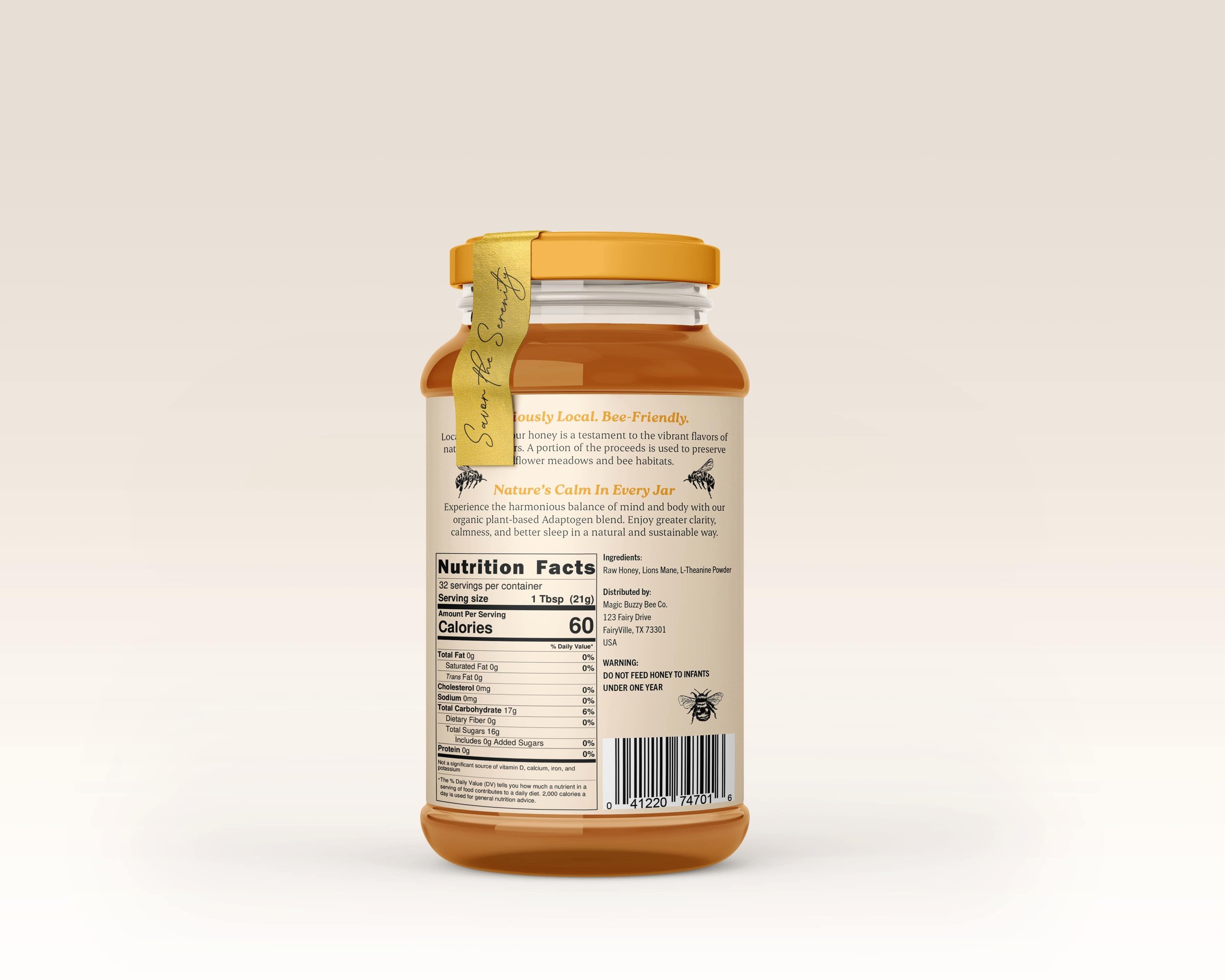
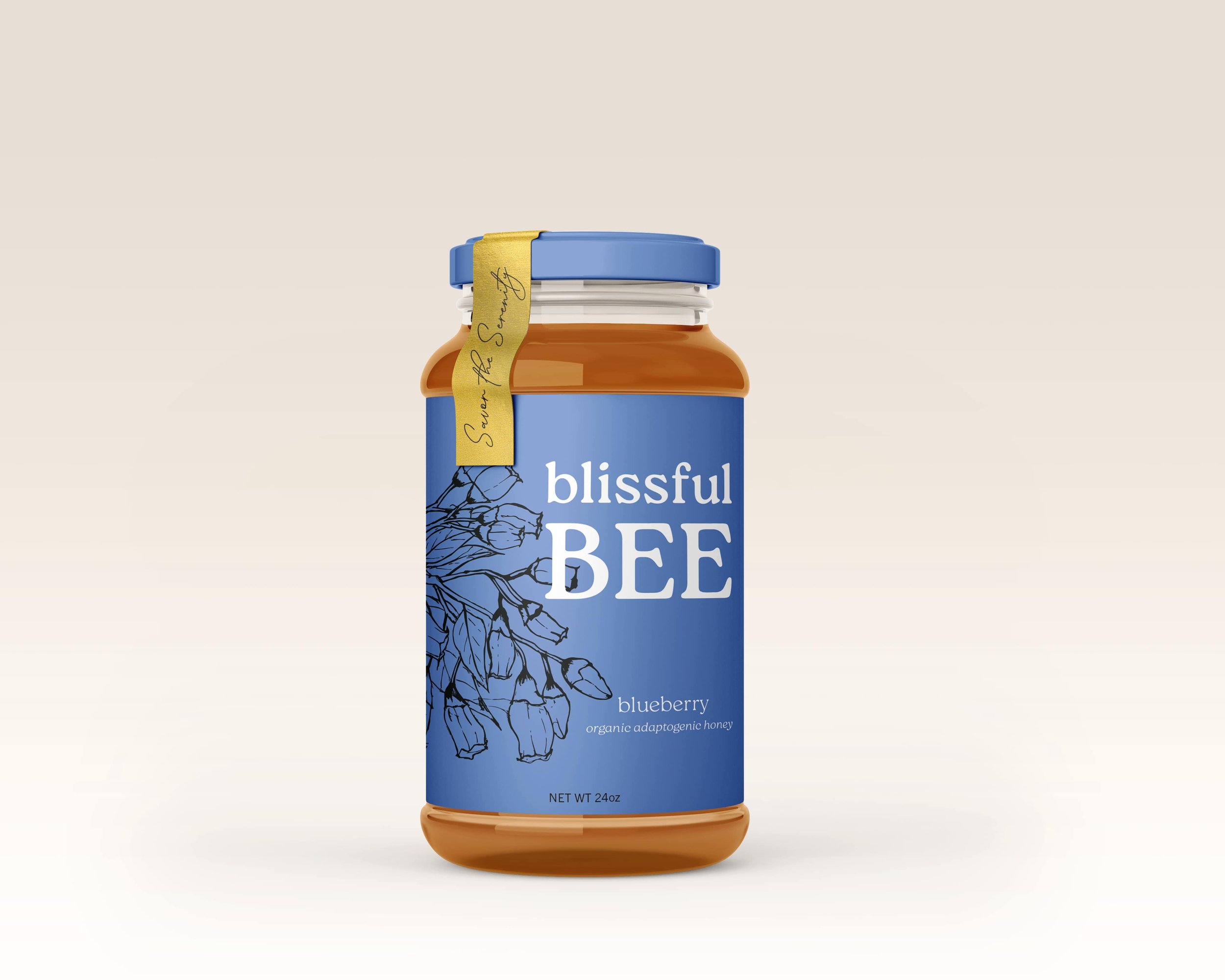
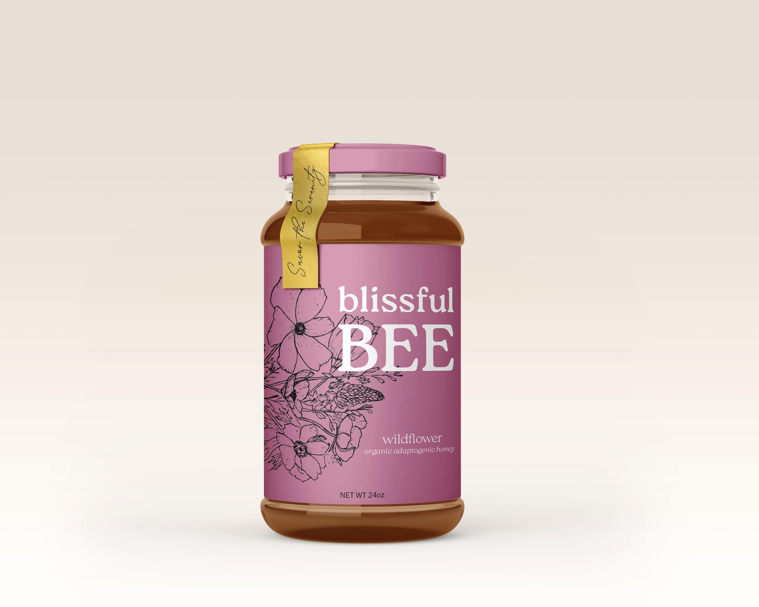
Blissful Bee honey products are restorative for both the customer and the planet. Every jar is organic, infused with natural adaptogens, and supports pollinator health by funding the restoration of wildflower meadows for native bee populations.
Target Audience: High-earning young professionals who enjoy hosting dinner parties and are willing to invest in premium food and thoughtful design.
Challenge: Develop a brand and packaging system that stands out on the table as much as it does on the shelf.


Reflection
During the research process, I developed several ideas to help my honey stand out on the shelves of higher-end food stores. I decided on glass jars for their recyclability and environmental benefits, and around this time I began exploring adaptogens as a way to appeal to young professionals. Adaptogens are natural substances, like ginseng, that help the body adapt to stress and regulate bodily processes.
I chose a blend of L-theanine and Lion’s Mane, which promotes calm, enhances mental clarity, and supports better sleep. This inspired the name Blissful Bee.
Early on, I wasn’t making the most of my sketches, and my initial script/serif font combination felt too predictable for the product. Refining the design with a softer serif, giving the brand name more prominence, and introducing a bright punch of color throughout helped the overall look feel much more balanced and cohesive. I’m pleased with how it turned out.