
Tiny Aquatics logo rebrand
Tiny Aquatics is a local fish store specializing in freshwater livestock that thrives in tanks of twenty gallons or less. The challenge was to redesign a logo that better captures the concept of "tiny" while also ensuring it can scale down effectively for various applications.
On-Site Visit (Inspiration)
What stood out to me during the visit were the beautifully aquascaped tanks, the cleanliness of the setup, the wide selection of fish and supplies, and-best of all-no betta fish in small plastic cups!


Sketches
Most of my sketches were realistic interpretations of the various critters you can find at their store. I only went for a "cutesy" approach with one or two designs, as that style didn’t seem to match the elegance of their planted tanks.
During the second round of sketches, I quickly realized that using "TA" as an abbreviation for the store name wasn’t practical. That said, I’m still quite fond of the crab with the bicep "tattoo."


The Challenge (Digital Drafts)
For the initial digital drafts, it came down to the fiddler crab and the betta fish. On one hand, the crab felt more unique. Many logos already feature betta fish. On the other hand, the betta seemed more fitting since the store specifically avoids housing bettas in small plastic cups. Its elegance also felt like a better match for the brand’s aesthetic. I struggled with incorporating type on a path for both options and experimented with adding "seaweed" inspired vector graphics to bring in texture and color. However, my peers all agreed that the graphics weren’t clearly coming across as plants.
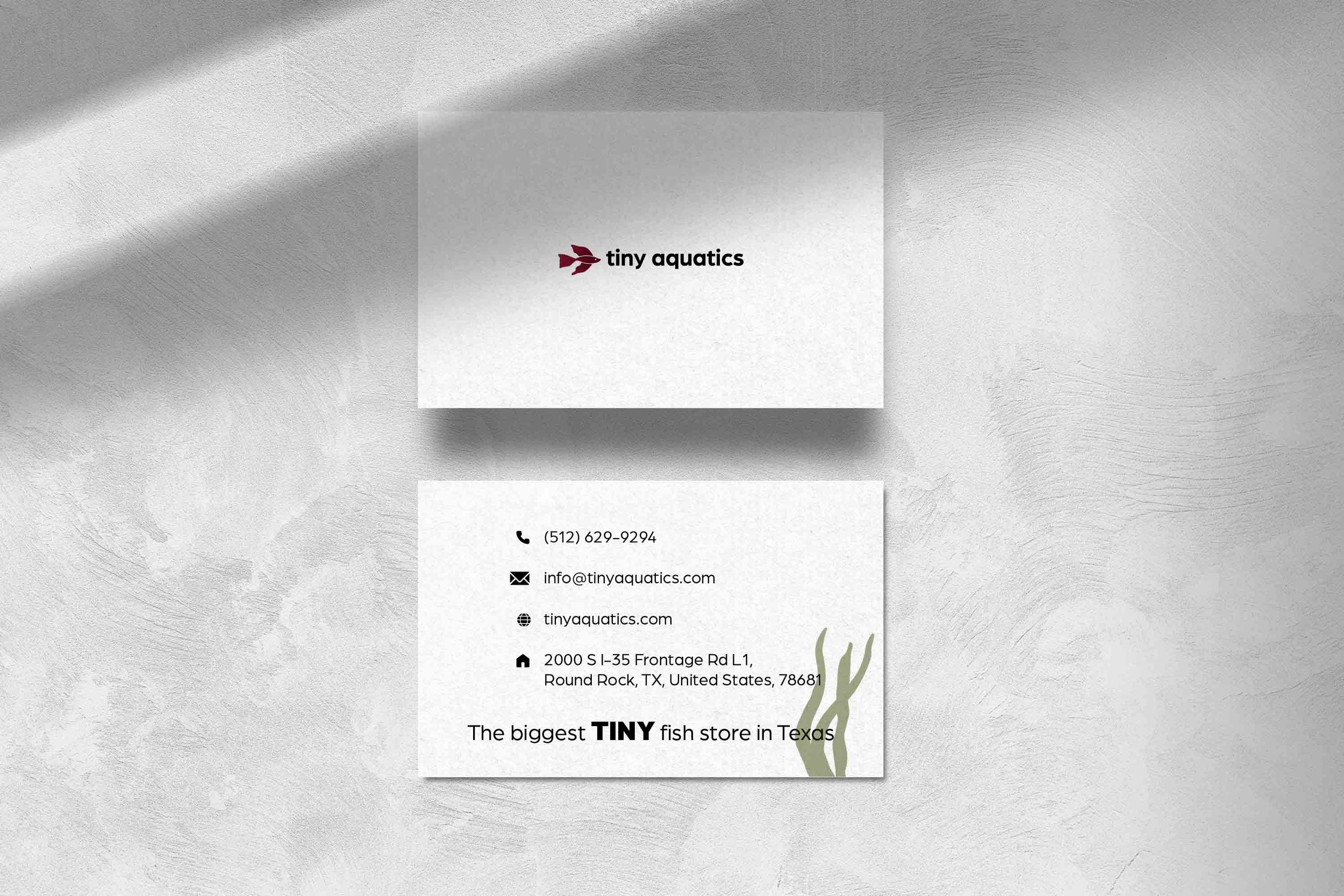
In the end, I chose the betta design, pairing it with a clean sans-serif font and offering two color options for both the text and the fish. However, I realized I had strayed from the original goal of creating something that conveys "tiny" and scales down effectively. To address this, I simplified the betta fish by reducing the intricate fin details. I also switched the text color to black to make the red pop and used all lowercase letters to further emphasize the "tiny" concept.


Final Solutions


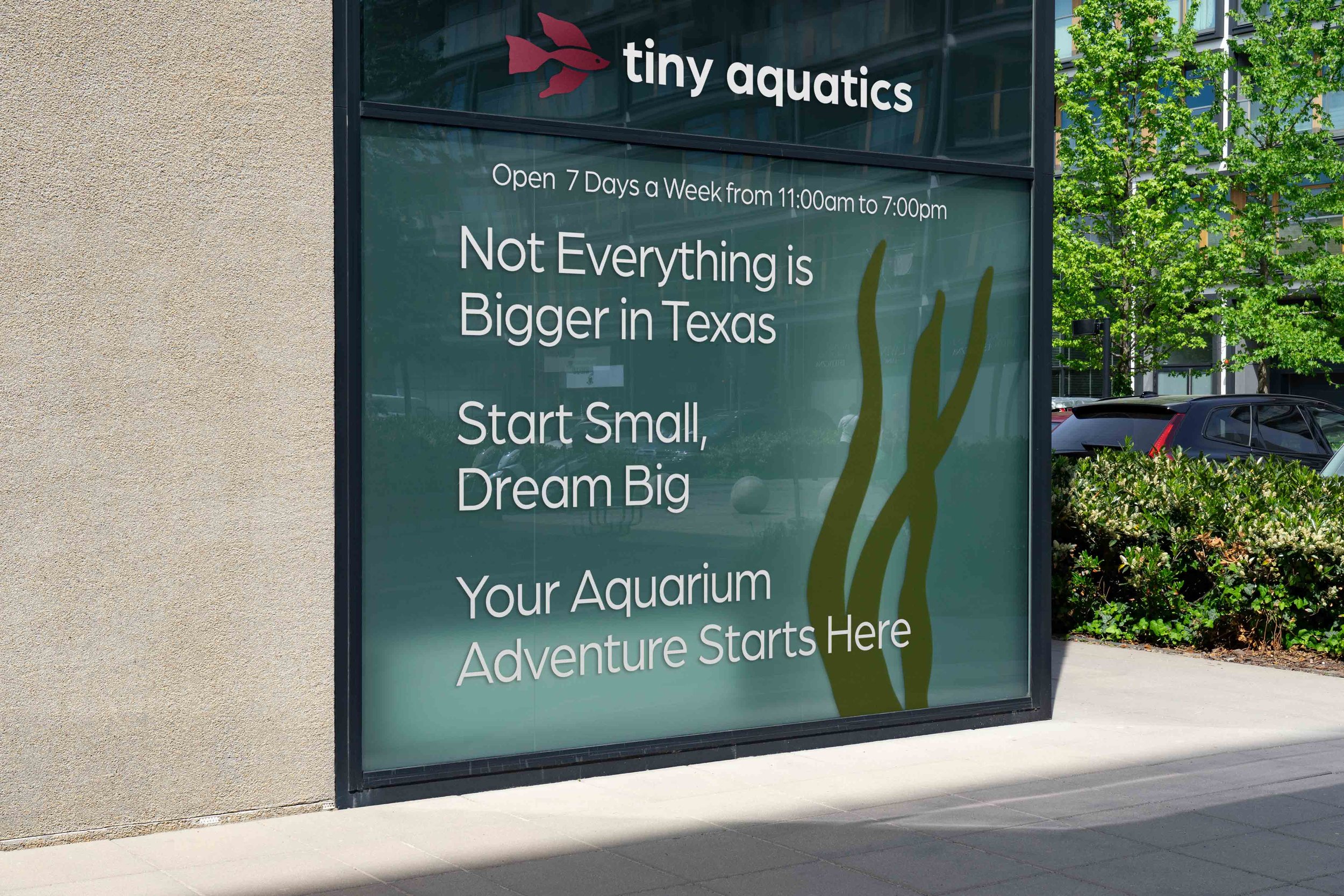
Mockups

Reflection
It was really hard to let go of my original betta design, but I do think the simplified version works well with the clean, lowercase sans-serif text. I would have liked to include plants and some of my other illustrations into more branding elements, and that’s something I’ll definitely try to do in the future. I still don’t know if this is the best way to convey the “tiny” concept however.